
Operational efficiency metrics are the measures that show how well you convert time, labour, and money into output. The immediate starting set most operations teams need is small: cycle time, first-pass yield, capacity utilisation, and operating expense ratio. Baseline each one against your own history over the last quarter, then assign one named owner per metric before you add anything else to the dashboard.
Table of Contents
- Operational efficiency metrics vs KPIs: what's the difference?
- Core operational efficiency metrics: formulas and benchmarks
- How do you choose and govern the right KPIs?
- How do you turn metrics into actual improvement?
- Why metrics backfire, and how to stop it
- What did AdaptAI's own client work show?
- A simple operational efficiency scorecard you can copy
- When does it make sense to bring in outside help?
- How AdaptAI helps you act on these numbers
- Sources
- FAQ
Operational efficiency metrics vs KPIs: what's the difference?
A metric is any number you measure. A key performance indicator (KPI) is a metric you've decided actually matters enough to review on a schedule and act on. Every KPI is a metric, but not every metric deserves KPI status, and mixing the two up is why so many dashboards end up cluttered with numbers nobody looks at twice.
The second distinction that trips people up is leading versus lagging. A leading indicator predicts what's about to happen, like the number of quotes in your pipeline this week. A lagging indicator reports what already happened, like last month's revenue per employee. You need both. Lagging metrics tell you whether the business is healthy; leading metrics give you enough runway to fix a problem before it shows up in the lagging numbers.
Operations KPIs generally sort into seven categories: throughput, quality, utilisation, cost, speed, reliability, and people. Operations leaders who actually track their numbers tend to pick two to three metrics per category rather than trying to monitor a dozen. That restraint matters more than it sounds. A dashboard with 40 metrics gets ignored; one with 15 to 20 well-chosen metrics gets used in every Monday meeting.
Here's how each category translates into something concrete:
- Throughput — units, orders, or cases completed per day or per team member.
- Quality — first-pass yield, defect rate, or the percentage of work redone.
- Utilisation — the proportion of available hours or machine time actually put to productive use.
- Cost — operating expense ratio or cost per transaction.
- Speed — cycle time, lead time, or on-time delivery rate.
- Reliability — mean time to repair (MTTR) or mean time between failures (MTBF).
- People — regrettable attrition, billable utilisation, or overtime hours trending over a quarter.
Notice that none of these categories exist in isolation. A team can hit a throughput target while quality quietly collapses, which is exactly why the category structure matters more than any single number on its own.
Core operational efficiency metrics: formulas and benchmarks
Once you know which category you're measuring, the formulas themselves are straightforward. The harder part is knowing what a "good" number looks like for your kind of operation, since a benchmark that fits a warehouse rarely fits a professional services firm.
Throughput: cycle time, lead time, and WIP
Cycle time is the time from when work starts to when it finishes. Lead time is longer. It runs from when a customer requests something to when they receive it, including any queue time before work even begins. Throughput rate is simply units completed divided by time period.
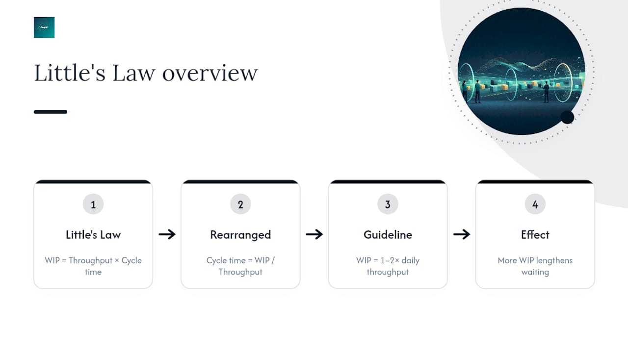
Work in progress (WIP) ties these together through Little's Law: WIP equals throughput multiplied by cycle time. Rearranged, cycle time equals WIP divided by throughput rate. For knowledge work specifically, the practical guidance from operations leaders is to keep WIP somewhere between one and two times your daily throughput. Pile more work in progress than that, and cycle times stretch out even though nobody added new work, because each item is now waiting behind more unfinished items.
Quality: first-pass yield and the true cost of rework
First-pass yield is the percentage of units or transactions completed correctly the first time, with no correction, return, or rework. The formula is units produced correctly divided by total units started, multiplied by 100.
Defect rate and rework ratio are the mirror image: how much of your output has to be touched twice. Rework rarely shows up as its own line item on a budget, which is exactly why it's dangerous. A support ticket resolved wrong the first time doesn't just cost the second agent's hour. It costs the customer's patience, a second round of scheduling, and often a discount or refund to smooth things over.
Utilisation and assets: capacity, billable hours, and OEE
Capacity utilisation measures actual output against maximum possible output over the same period, expressed as a percentage. Billable utilisation, the metric most professional service firms live or die by, is billable hours divided by available hours. Billable utilisation is a primary revenue driver for service businesses, and pushing it up even a few points without adding headcount flows almost directly to the bottom line.
Overall Equipment Effectiveness (OEE) is the standard for manufacturing and asset-heavy operations. It multiplies three components: availability (actual run time divided by planned production time), performance (actual output speed divided by ideal speed), and quality (good units divided by total units). Multiply all three together and you get a single number that exposes exactly where you're losing capacity, whether that's downtime, slow cycles, or scrap.
Cost, speed, and reliability at a glance
| Metric | Formula | Typical use |
|---|---|---|
| Operating expense ratio | (OPEX + COGS) ÷ net sales × 100 | Shows what share of every sales dollar gets absorbed by running costs |
| Cost per transaction | Total processing cost ÷ number of transactions | Tracks efficiency gains from automation over time |
| Revenue per employee | Total revenue ÷ headcount | Broad productivity gauge, best read as a trend, not a single snapshot |
| On-time delivery | Orders delivered on/before promise date ÷ total orders × 100 | Customer-facing reliability signal |
| MTTR | Total repair time ÷ number of repairs | How fast you recover from a failure |
| MTBF | Total operating time ÷ number of failures | How often failures happen at all |
The operating expense ratio is worth flagging separately because it's the cleanest bridge between operations and finance. Operations teams often measure activity; finance teams measure dollars. This ratio speaks both languages at once.
People metrics: utilisation ranges and attrition
Utilisation numbers need a ceiling as much as a floor. Sustained utilisation above 90% predicts burnout and a drop in quality, and most operations should target somewhere in the 70 to 85% range instead of chasing maximum output. Regrettable attrition, meaning departures you didn't want, is the other people metric worth tracking alongside utilisation, since the two often move together with a lag of a few months.
How do you choose and govern the right KPIs?
Pick 5 to 8 executive-level KPIs, no more. Small and mid-size businesses do best limiting themselves to the number leadership can actually act on in a single 60-minute monthly review, which in practice lands at 5 to 8. Below that executive layer, individual teams can and should track more granular operational metrics, since a warehouse supervisor needs finer detail than a CEO does.
Here's a practical sequence for setting up governance that actually holds:
- Write down the exact formula once. Include the timeframe and any exclusions (does "on-time" mean by end of day or by the promised hour?), then apply that same definition every time. Inconsistent formulas are the number one reason two people in the same meeting argue about numbers that should agree.
- Collect 3 to 6 months of history before setting a target. Your own trend line is the first benchmark. External industry figures are useful context, but your baseline should come from your own operation first.
- Assign one named owner per KPI. Not a team, not a department, one person accountable for the number moving in the right direction.
- Set a review cadence by level. Operations leads review weekly. Executives review monthly. Strategic targets get revisited quarterly.
- Pair every leading indicator with a lagging financial one. Pipeline volume alone tells you nothing about margin; pair it with revenue per employee or operating expense ratio so a good-looking leading number can't hide a bad trend underneath.
Well-designed KPIs and dashboards drive financial success and team alignment, but poorly designed ones actively incentivize the wrong behaviour. That's not a small risk. A KPI that rewards speed without accounting for quality will get you speed, and you'll pay for the quality gap somewhere else in the business within a quarter.
Pro Tip: Retire any KPI that goes three review cycles without prompting a decision or an action. If nobody changes behaviour because of a number, it's dashboard clutter, not a KPI.
How do you turn metrics into actual improvement?
Start by mapping your core value chains: order-to-cash, lead-to-client, hire-to-productive, and purchase-to-pay. Mapping these core processes and focusing on cycle times, error rates, utilisation, and cash conversion gives you a clear view of where waste actually accumulates, rather than guessing based on which department complains loudest.
Once you've mapped a process, prioritise fixes using impact multiplied by ease, essentially a Pareto approach. Target high-volume, repetitive tasks first, since a small percentage improvement on something done a thousand times a month beats a large improvement on something done five times.
A sequencing rule that saves a lot of wasted effort: automate data collection and reporting before you automate any decision-making. You need clean, reliable inputs before you can trust an automated output. Use tools you already have before buying anything new.
Where does AI in operations genuinely help right now?
- Demand forecasting — spotting patterns in historical order data that a static spreadsheet formula misses.
- Predictive maintenance — flagging equipment likely to fail before MTBF numbers confirm it after the fact.
- Automated reconciliations and reporting — pulling numbers from separate systems into one scorecard without manual copy-paste.
AI forecasting can make operational metrics forward-looking rather than purely historical, but that only works if the underlying data governance is solid. Any AI use case in operations needs a short checklist before rollout: who owns the model's output, how often it's reviewed against actual results, and what happens when it's wrong.
Pro Tip: Before automating anything, ask whether the process would still make sense if a person had to do it manually tomorrow. If the answer is no, you're automating a broken process, not fixing one.
Why metrics backfire, and how to stop it
Goodhart's Law states that when a measure becomes a target, it stops being a good measure. This isn't an abstract warning; it's the daily reality of call centre agents who rush calls to hit a handle-time target, or sales reps who close low-value deals to hit a quota. The number goes up while the thing you actually cared about goes down.
Three defensive patterns hold up well against this:
- Pair metrics. Never track speed without quality, or volume without margin, in the same review.
- Keep an audit trail. Practical defences include an independent data steward, rotating who attends KPI reviews each quarter, and a short glossary defining every metric attached to the dashboard itself.
- Set anomaly alerts. A metric that suddenly improves faster than the underlying process could plausibly explain deserves a second look, not a celebration.
Utilisation is the metric most prone to misuse. Watch overtime trends alongside it. If utilisation looks healthy but overtime is climbing month over month, the number is hiding fatigue rather than measuring efficiency.
What did AdaptAI's own client work show?
AdaptAI's AutoLedger project, built for a Surrey-based accounting firm, is a useful case in point for what integrated measurement actually looks like in practice. The firm was running separate systems for client intake, invoicing, and reporting, with staff manually re-entering data between them.
- What was measured: cycle time from client request to completed deliverable, and work in progress across the team.
- What changed: consolidating the tools behind one login cut the manual re-entry that was inflating cycle time and hiding true WIP levels.
- Reported result: the firm's experience lines up with reports of reduced administrative work per week after implementation.
- What sustained it: ongoing AI training for the team, so the gains didn't quietly erode once the initial build was finished.
You can read the fuller AutoLedger case study for the specifics of how the integration was scoped.
A simple operational efficiency scorecard you can copy
A scorecard only works if every column forces a decision, not just a number. Nine columns cover what you need: metric name, formula, data source, owner, baseline, target, current value, trend, and review cadence.
Here's one worked row to show the structure in action:
That's the whole point of a scorecard. It should tell you what to do next, not just what happened.
Automate the data feed behind each row wherever you can. Manual entry into a scorecard is itself a rework risk, the exact kind of hidden inefficiency the scorecard is supposed to catch elsewhere in the business. A management reporting approach that connects operational data directly to financial reporting removes one more manual handoff from the chain.
When does it make sense to bring in outside help?
Accept that your first scorecard will need iteration. Start with five metrics, stabilize them for a full quarter, and resist the urge to add a sixth before the first five are actually driving decisions.
The harder judgment call is when to move from a spreadsheet or an off-the-shelf dashboard to a custom integrated system. My honest view is that off-the-shelf works fine until your data lives in more than two or three disconnected tools. Past that point, the manual reconciliation between systems becomes its own operational inefficiency, and it's usually invisible until someone calculates the hours lost to it. Measure the ROI of any systems project the same way you'd measure any other KPI: baseline the admin hours before, track them for a full quarter after, and be honest if the number doesn't move enough to justify the cost.
— Harry Gill
How AdaptAI helps you act on these numbers
If your operational data is scattered across a CRM, a separate invoicing tool, a scheduling app, and a spreadsheet nobody trusts, no scorecard template fixes that on its own. AdaptAI builds custom software that consolidates those systems behind one login, so the metrics in this article, cycle time, first-pass yield, WIP, pull from one clean data source instead of four disconnected ones. Clients commonly report saving significant administrative work hours per week once that consolidation is in place.

Beyond the build itself, AI workflow automation handles the repetitive data entry and reconciliation work that inflates cycle time in the first place, and AI training and workshops make sure your team keeps improving the system after launch rather than reverting to old habits. Every project runs on fixed pricing with regular milestones, and you own the code outright with no lock-in. If you want to see whether your current setup is a good candidate for this kind of consolidation, start with an AI Discovery Sprint to map where your admin hours are actually going.
Sources
FAQ
What are the top 3 KPIs for operations?
Most operations teams get the most value from tracking cycle time, first-pass yield, and capacity utilisation first. Those three cover speed, quality, and resource use, the three areas where inefficiency tends to hide most often. Add cost and reliability metrics once these three are stable and reviewed regularly.
What are examples of operational metrics?
Common examples include cycle time, lead time, throughput rate, defect rate, on-time delivery, mean time to repair, and operating expense ratio. Each maps to one of seven categories: throughput, quality, utilisation, cost, speed, reliability, and people. Choosing two to three per category keeps a dashboard usable instead of overwhelming.
What are some examples of efficiency metrics?
Efficiency metrics express output as a ratio against resources used, such as OEE, capacity utilisation, and the operating expense ratio, which is (OPEX plus COGS) divided by net sales. Billable utilisation serves the same purpose for service businesses, measuring billable hours against total available hours.
What are the 5 key performance indicators?
There's no single universal list of five, since the right KPIs depend on your industry and process, but a solid starting set for most operations is cycle time, first-pass yield, capacity utilisation, operating expense ratio, and on-time delivery. That combination covers speed, quality, resource use, cost, and customer-facing reliability in one view.
How much does it cost to build a custom operational scorecard system?
AdaptAI prices each project individually based on how many systems need to connect and how complex the automation is, so current pricing details are available directly through the AdaptAI site. Every engagement runs on fixed pricing agreed before work begins, with no ongoing lock-in once the build is complete.